You have a brilliant idea for a new marketing campaign, a website redesign, or a compelling presentation. You try to explain it to your designer (or an AI design tool), but the results just aren’t quite right. “Make it pop more,” you say. “It needs to feel more modern,” you suggest. The designer nods, but the next iteration still misses the mark.
The problem isn’t a lack of talent; it’s often a language barrier. Designers speak in terms of hierarchy, negative space, and visual metaphors, while non-designers often speak in business objectives and subjective feelings.
The good news? You can learn to bridge this gap. By using specific, actionable prompts, you can translate your vision into a language creatives (human or AI) understand. This guide provides 20 powerful prompts to help you communicate your creative vision with clarity and precision, leading to better designs and fewer revisions.
Why Specific Prompts Matter More Than Vague Feedback

Vague feedback like “make it pretty” leaves too much to interpretation. Specific prompts, on the other hand:
- Provide Clear Direction: They guide the creative process from the outset.
- Reduce Guesswork: Designers spend less time trying to figure out what you mean.
- Ensure Consistency: Especially important when working with AI, which interprets prompts literally.
- Save Time & Money: Fewer revisions mean faster project completion.
Let’s dive into the language of creatives with these 20 prompts:
Setting the Stage: Context & Goals
- The Core Purpose: “The primary goal of this design is to [e.g., drive sign-ups for our newsletter, inform users about a new feature, build brand awareness for our upcoming event].”
- The Deliverable & Platform: “We need a [e.g., social media graphic, website hero section, presentation slide template] for [specific platform/use, e.g., Instagram Stories, our homepage, internal team meetings].”
- The Call to Action: “The main action we want users to take is to [e.g., click ‘Learn More’, download the report, contact us via the form].”
Defining Audience & Brand Identity
- Target Audience Persona: “This design is for [e.g., young professionals aged 25-35, small business owners in the retail sector, tech-savvy early adopters] who value [e.g., efficiency, sustainability, luxury, community].”
- Brand Personality: “Our brand personality is [e.g., innovative and approachable, classic and trustworthy, playful and energetic, sophisticated and minimalist].”
- Core Brand Keywords: “The core brand keywords we want this design to convey are [e.g., reliable, modern, friendly, premium, secure, inspiring].”
Visual & Emotional Tone
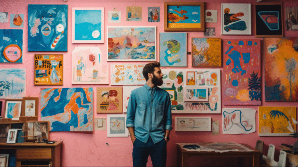
- Overall Mood/Feeling: “We want the user to feel [e.g., inspired, calm, excited, secure, empowered, curious] when they see this design.”
- Visual Metaphor: “Visually, we want to convey the idea of [e.g., growth and upward trajectory, seamless connection, effortless simplicity, dynamic speed].”
- Energy Level: “The design should feel [e.g., dynamic and high-energy, serene and minimalist, bold and impactful, subtle and elegant].”
- Sophistication Level: “It should be [e.g., highly sophisticated, casually elegant, straightforward and functional, edgy and rebellious].”
Specific Design Elements: Colors, Fonts, Layout
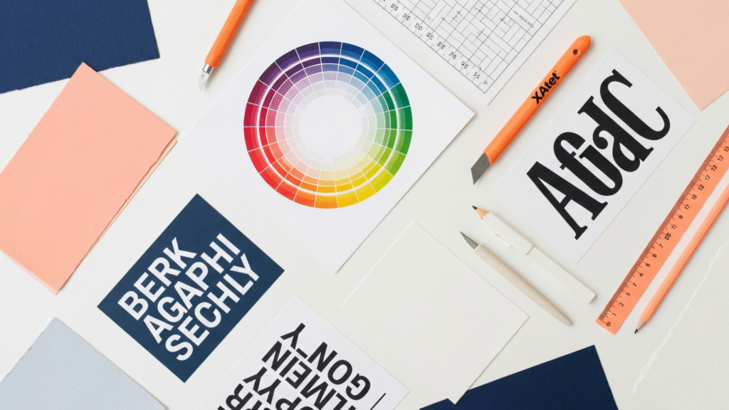
- Color Direction: “Use a color palette that is [e.g., warm and inviting, cool and professional, vibrant and energetic, muted and earthy, monochromatic with a single accent].” (You can add specific hex codes if known).
- Typography Style: “For typography, we prefer [e.g., clean sans-serifs for modernity, elegant serifs for tradition, bold display fonts for impact, a handwritten feel for authenticity].”
- Composition & Layout: “The layout should be [e.g., clean and spacious with ample white space, dense and information-rich, asymmetrical and dynamic, grid-based and structured, photography-driven].”
- Visual Hierarchy: “The most important element, [e.g., the headline, the product image, the call-to-action button], should be the dominant visual focus, drawing the eye first.”
Technical & Practical Details
- Dimensions/Aspect Ratio: “The final output needs to be [e.g., 1080x1080px, 16:9 aspect ratio, suitable for print A4 portrait, responsive for mobile and desktop].”
- File Format: “Deliver in [e.g., PNG for web, SVG for icons, print-ready PDF, editable Figma file].”
- Accessibility: “Ensure the design meets [e.g., WCAG 2.1 AA standards for contrast, is legible for color-blind users, uses clear and readable fonts].”
Guiding & Refining: References & Exclusions
- Inspirational References: “We like the aesthetic of [e.g., Apple’s product pages, Nike’s ad campaigns, the website ‘Awwwards.com/sites/example’, the photography style of Kinfolk magazine].” (Provide links if possible).
- Competitor Differentiation: “This should look distinctly different from [Competitor X] and [Competitor Y], specifically avoiding their use of [e.g., bright red, busy layouts, generic stock imagery].”
- Exclusions/Avoidances: “Please avoid [e.g., stock photo clichés (handshakes, puzzle pieces), overly complex illustrations, gradients from the early 2000s, anything that feels too corporate or impersonal].”
By incorporating these types of specific prompts into your design requests, you’ll provide a much clearer roadmap for your creative partners, whether they’re human designers or advanced AI tools. This precision reduces misinterpretations, speeds up the design process, and consistently delivers results that align with your vision.
Start practicing these prompts today, and watch your creative communication transform!
Ready to streamline your design requests and ensure consistent, on-brand output? Platforms like Qolaba provide a unified workspace where you can store and share these optimized design prompts as reusable templates. By centralizing your creative briefs and guidelines, Qolaba helps your entire team speak the language of creatives, ensuring every design project—whether human-led or AI-assisted—aligns perfectly with your brand vision and delivers measurable impact.

